FIGR AI • POSITIONING & WEBSITE LAUNCH
Repositioning Figr around the context other AI tools missed & converting 12.5% of visitors into sign-ups


My role
Years
October - November 2025
Platform
Website
Scope
Team
CEO
TL;DR
Reframing Figr around the context other AI tools missed helped turn 12.5% of website visitors into sign-ups
I partnered with a co-founder to sharpen Figr’s position, turned it into a proof-led launch narrative, designed the responsive experience and product animations in Figma, and built it independently in Webflow.
12.5%
visitor-to-sign-up conversion after launch
problem discovery
Figr had outgrown its speed-led landing page, but new visitors still saw another prompt-to-prototype tool
The early website was built to collect sign-ups while we tested the product. Speed fit that phase.
By public launch, Figr could work from existing screens, question an ambiguous brief, surface edge cases and create editable design. The website still made it sound like a faster way to generate UI.
Customer calls exposed the mismatch. One team asked what a PM could actually achieve with Figr. Another wanted to inspect the depth of the work before trying it. A complete existing-product example made the difference understandable almost immediately.
The request beneath all three moments was the same: show me why this is different before asking me to trust it.
the blackbox problem
Talking to users made the gap obvious: speed was everywhere, but understanding an existing product was still rare
The position came from product-discovery conversations with PMs and designers, observed beta behaviour, customer feedback and a fresh market review. Most alternatives clustered around one promise: get from prompt to prototype faster.
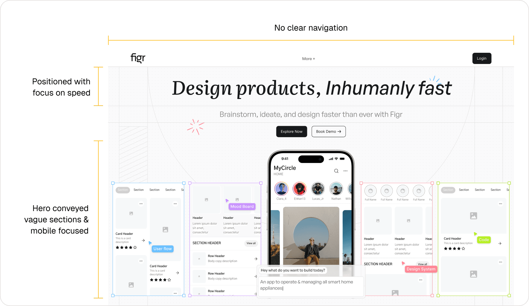
Problems with the Landing page Hero

Problems with the Landing page Hero
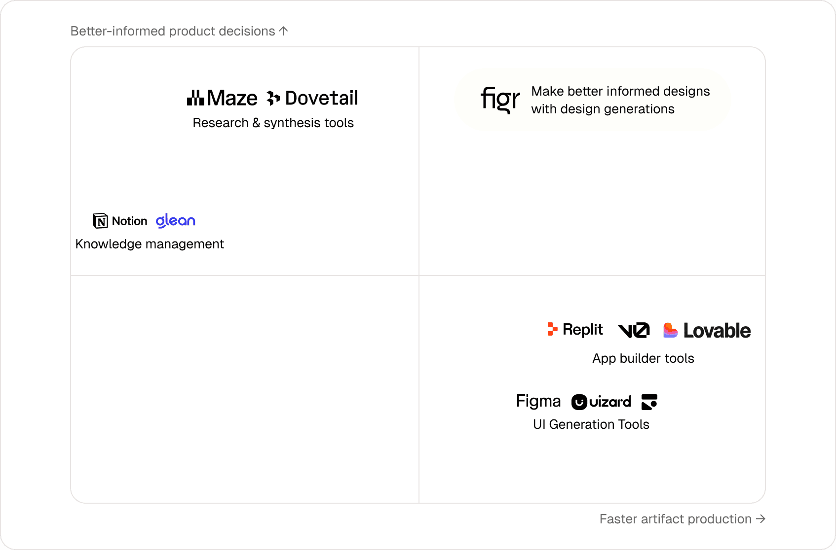
Directional placement based on homepage messaging, not a scored feature benchmark
Competitive alternative
What it did well
Where the work still broke
Prompt-to-prototype and AI coding tools
Produced a convincing first draft
Teams still stitched together context, UX intent and system rules
General AI tools
Explored open-ended questions
Product knowledge disappeared across conversations
Manual workflows
Preserved nuance through people
Context fragmented across documents, meetings and handoffs
Beta teams reached for Figr with harder problems after simpler tools produced shallow results. Its clearest value appeared when they brought an existing screen, flow or recording to improve.
“Building on your live product” was not a line invented for launch. It was the behaviour already making the product useful.
April Dunford’s framework gave us a basic checklist for naming the alternatives, audience and value. It did not decide the position. The repeated behaviour did: speed was table stakes, existing-product context made Figr easiest to understand and prospects wanted to see the depth before trying it.
That produced one organising idea:
The market was crowded around faster output. The open space was helping teams understand what to build; and carrying that understanding into design.
target audience
Product Managers became the entry point—but the website had to prove Figr would create better inputs for designers, not more cleanup
PMs often began with a business goal, a messy specification and incomplete context. Designers inherited the journey, missing states and responsibility for quality. That made PMs the clearest entry point—but “design without designers” would have created the wrong expectation. The website instead framed Figr as a bridge:
For PMs: turn scattered context into clearer flows, edge cases and visual directions.
For designers: receive a more reasoned, editable starting point grounded in the existing product.
The promise was not fewer designers. It was less avoidable interpretation between intent and execution.
narrative for the homepage
We built the homepage as a progressive argument: expose the category failure, reveal Figr’s approach, then earn the right to ask for trust
Figr’s differentiation was not a single feature. It was the chain between understanding an existing product and producing work that respected it. A feature grid would have flattened that into a list—and made Figr look more like the tools we were trying to distinguish it from.
We structured the homepage around the questions a sceptical product team would ask, controlling what they learned at each scroll:
The same live-product workflow became the spine of the page. Each section added a new piece of evidence to it, so the visitor did not have to assemble Figr’s value from disconnected feature claims.
animation was important
Static screenshots made Figr look like another generator, so animation showed the sequence competitors were skipping
A polished final screen was not enough to communicate the difference. In a static image, Figr could still be mistaken for a tool that generated attractive UI from a prompt.
The text made the claim; the animation demonstrated the cause and effect. Instead of decorative motion or disconnected feature loops, each sequence had one job: show how more understanding led to a better product decision.
Website story animation
responsibilities
Owning the narrative from Figma through Webflow kept the positioning, animation and production site aligned
The landing page grew into a reusable site system: a positioning-led homepage, product demonstrations, customer stories, a blog, shared navigation and conversion sections, and separate self-serve and sales-led paths.
Owning both sides meant I could tune copy, scroll pacing and animation together as the story evolved. The modular system kept those narrative beats intact across the homepage, customer stories and supporting pages instead of treating motion as a layer added after the design was complete.
website impact
The launch site converted 12.5% of visitors—but sign-up was only the first proof of value
After launch, 12.5% of website visitors signed up for Figr.
This was a site-level rate, not uplift from an A/B test. Positioning, proof, conversion paths and traffic mix changed together, so it cannot isolate one winning message.
It also stopped at sign-up. Activation still depended on visitors bringing the right problem and enough context into Figr. The next measurement needed to follow the journey from landing page to first useful query and repeat use.
learnings & reflections
The highest-leverage decisions happened before Figma; and motion worked best when it behaved like evidence
Positioning is a product decision before it becomes copy. Choosing the problem Figr could own clarified the audience, hierarchy and what the website did not need to say.
A homepage is an argument, not an inventory. Sequencing the problem, mechanism and proof made a complex product easier to understand than giving every capability equal weight.
Motion earns its place when it explains causality. Showing context become reasoning—and reasoning become design—communicated more than a page of AI adjectives.
