figr ai • 0→1 PRODUCT STRATEGY & DESIGN
Taking Figr from an early hypothesis to a product direction validated in closed beta


My role
Product Designer
Years
February - September 2025
Platform
Web Application
Scope
Team
4 Engineers & CTO
TL;DR
Testing three product bets turned a broad AI ambition into an open canvas used by around 20 beta teams
Figr began with a belief that AI could help product teams build better, but there was no established product model or roadmap. I turned that ambition into three falsifiable bets, designed the proof of concept and carried what survived into closed beta.
Worked with 5 partner teams and spoke with 50+ product managers and designers
Tested 3 hypothesis before investing in the complete product
Onboarded around 20 teams into the closed beta
Directional validation through guided onboarding—not proof of self-serve adoption.
problem discovery
We started with an ambition, not a roadmap; so the first job was deciding which problem deserved a product
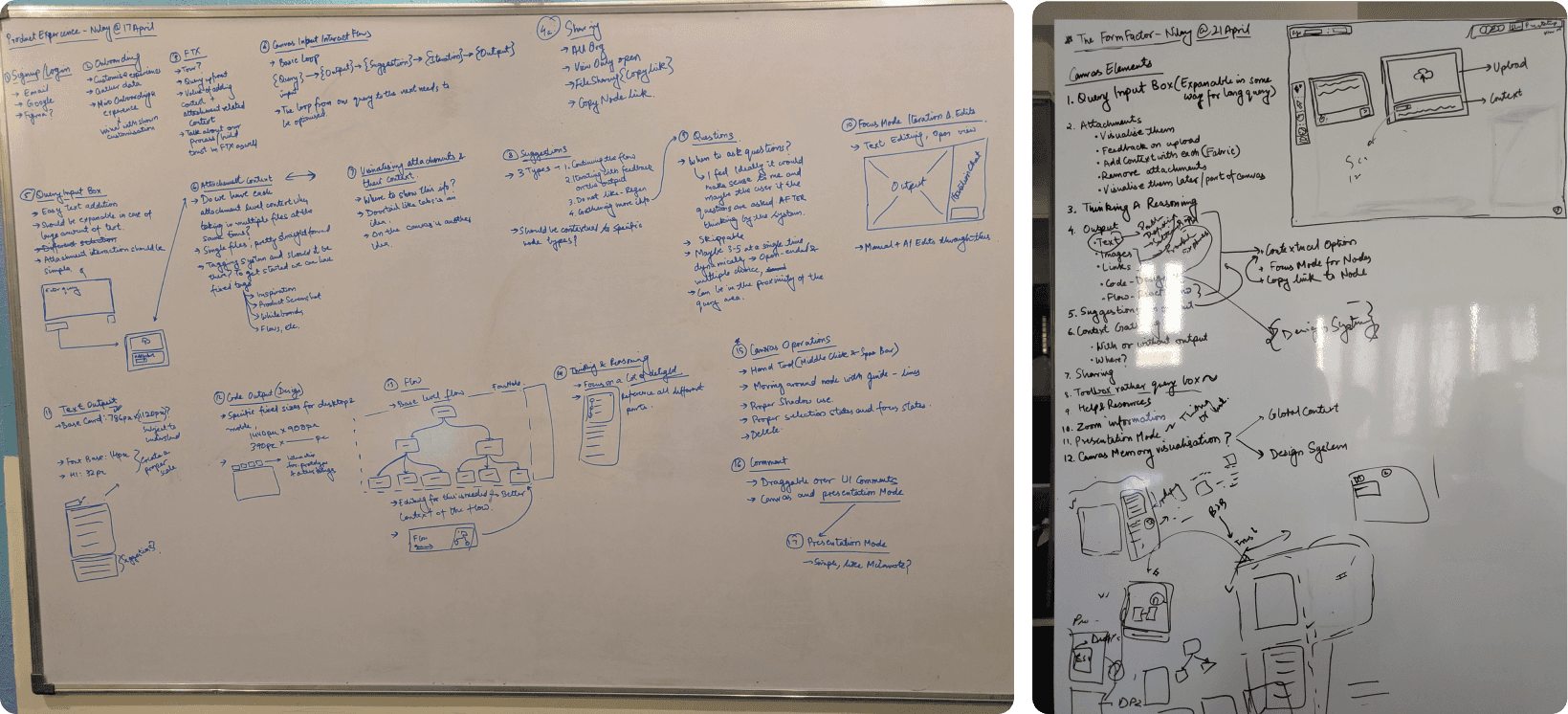
At pre-seed, jumping into interface design would have been the easy part. The harder question was which product problem AI should own.
Working with 5 partner teams and speaking to around 50 PMs and designers, we studied how work moved from a vague problem to a shipped experience; and where context vanished between documents, meetings and design files.
two sides of the problem
PMs and designers had different jobs; but lost the same product context between problem and interface
Across 50+ conversations with product managers and designers, I studied how a vague problem became a shipped experience. PMs began with goals, feedback and loose requirements; designers inherited that direction through briefs, meetings and disconnected artifacts.
Existing AI tools accelerated execution, but the harder gap appeared earlier: product reasoning disappeared before a useful prototype existed. The opportunity was not simply to generate a screen faster. It was to help teams develop what to build, then keep that thinking connected to the output.
Open-ended problems
Loss of context
Product Managers
Started with goals, feedback and loose requirements, but no clear direction.
Inherited ambiguity
Scattered context
Product Designers
Received that direction through briefs, meetings and disconnected artifacts.
Pain Points
Needs
1
Problem
definition
2
Research & Market Analysis
3
Concept development & vaidation
4
Strategy & business analysis
5
Prototyping & early design
The gap in AI-process
Current Tools


6
Testing & market feedback
The opportunity was not simply faster screen generation:
Could Figr combine product context with UX reasoning to help teams decide what to build before generating the interface?
DECISION 01 · MAKE THE RISKS TESTABLE
I made the product thesis testable before we invested in a polished application
The POC was deliberately rough. Its job was to separate ideas that sounded compelling from interactions people would actually use. I framed three bets; once the first POC existed, five partner teams helped us test and refine what deserved a product around it.
1
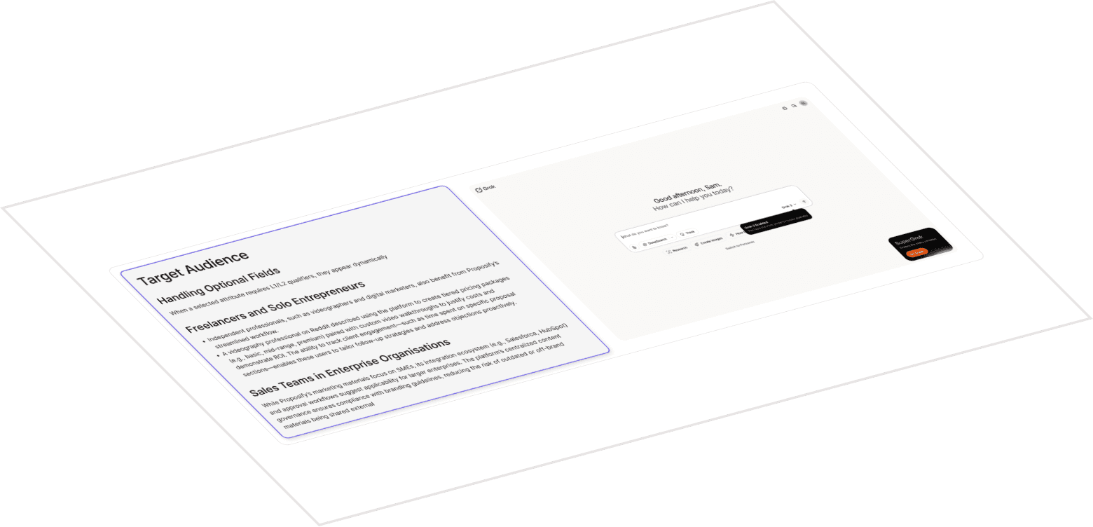
Structure context upfront through separate user, product and constraint fields
2
A gallery-like canvas for generated designs, Markdown and Mermaid flows
3
Proactive questions designed to challenge assumptions and uncover missing cases

Open-ended problem led to many directions & quick ideations
We believed...
We learned…
Result
Structure context upfront through separate fields
People hesitated over the categories and had to organise their thinking before receiving value
Not Validated
Ask before creating through proactive AI questions
Questions exposed missing goals, constraints, assumptions and edge cases
Validated
Keep the work connected through a shared canvas
Teams understood documents, flows and designs as parts of one evolving direction
Validated
One bet failed and two survived. That gave the CTO and engineering a specific interaction model to invest in rather than a broad AI proposition.
DECISION 02 · REMOVE UPFRONT STRUCTURE
The failed bet changed where the product asked users to do the work
Separate setup fields asked people to sort incomplete thinking before Figr had earned their trust. They were preparing input for the AI instead of starting with the problem they actually had.
I replaced the setup with one open input. A user could begin with a loose brief, an incomplete thought or an existing artifact. Figr asked for missing context only when it became relevant, challenging assumptions without demanding a perfect prompt upfront.
This was not less structure. It was structure revealed at the right time.

Failed hypothesis: Structured context information in the POC
DECISION 03 · MAKE THE CANVAS THE PRODUCT
Conversation opened the problem. The canvas held the evolving direction.
Most AI tools placed chat at the centre and treated the work as its output. We reversed that hierarchy: the centred query was temporary; the Canvas was persistent.
As clarification produced documents, flows and designs, the work stayed visible and connected. The closed-beta rhythm became:
Start openly → clarify progressively → work spatially
Figr felt less like a prompt-to-output tool and more like a place to think with AI. It also exposed the next interaction problem: keeping the query open obscured the Canvas, while closing it hid the conversation.
UI coverage and structuring
UI DESIGN · CANVAS ANATOMY
Five interface layers kept an open canvas understandable as the product grew
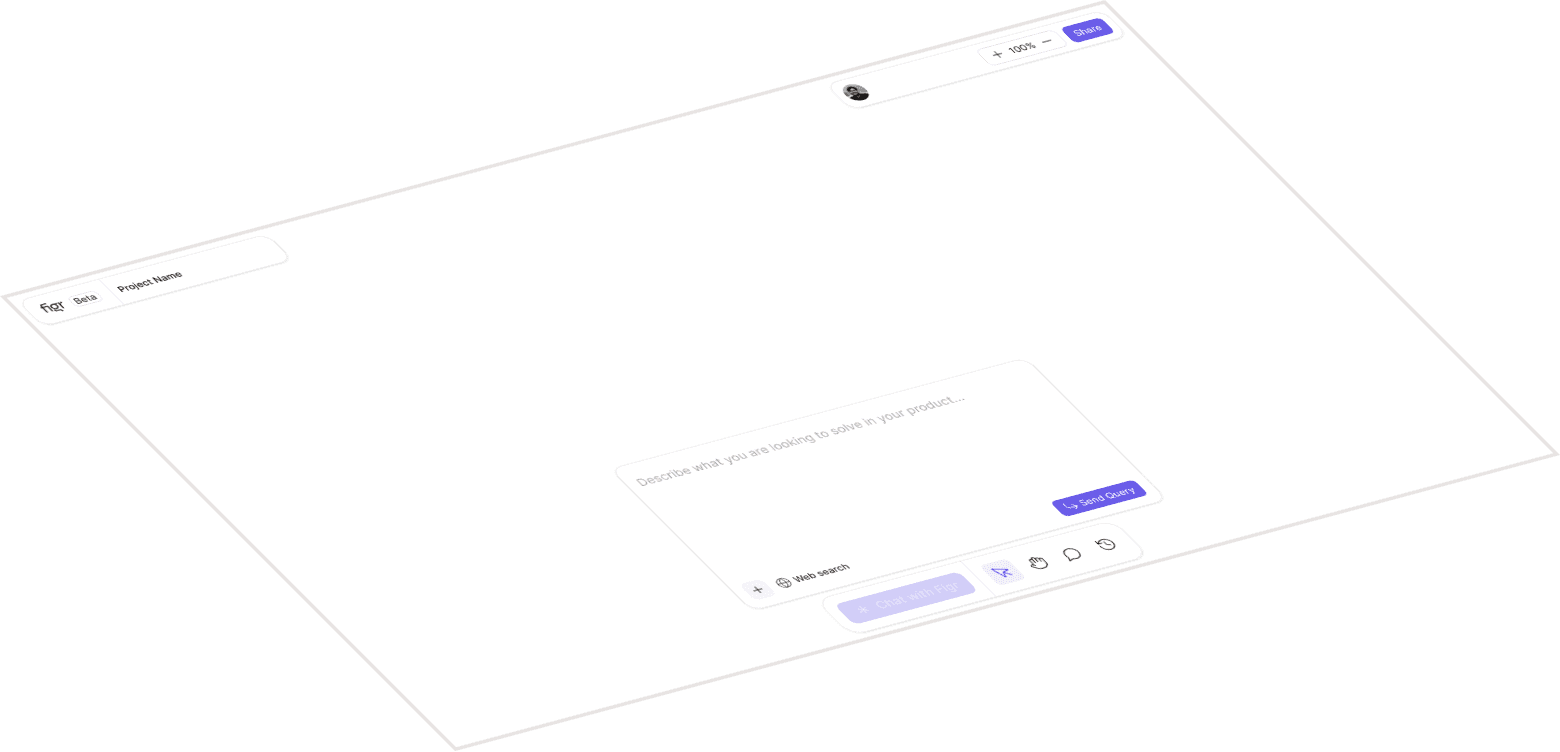
The product needed to feel expansive without becoming visually unstructured. I separated the interface into five layers so people could understand what was permanent, what belonged to their work and what appeared only when needed.
Anatomy of the canvas



Canvas
Hold the problem, reasoning and outputs in one expansive workspace
AI Artifacts
Give documents, flows and designs spatial structure and visible relationships
Fixed UI
Keep navigation & global actions available without competing with the work
Contextual UI
Give users access to the specialized tools to manipulate the content of the canvas
Modal UI
All the windows, modals, and pop-ups on top of the other application layers.
The canvas layers coming together
The empty state centred the input to create focus. As artifacts accumulated, the Canvas took over while fixed navigation framed the workspace and actions followed selection. The same interface could move from one open question to a dense project without exposing every control at once.
Attachments management on the canvas
Even in the MVP, a little delight is necessary
CLOSED-BETA EVIDENCE
Closed beta confirmed where Figr felt different—and where the evidence stopped
Around 20 teams reached closed beta through guided onboarding. Across their real work, three patterns repeated:
Existing products created the clearest value
Teams got the most value when they brought an existing screen, flow or artifact to improve or extend.
Deeper questions built trust
Meaningful clarification showed that Figr understood the complexity instead of jumping straight to a design.
Harder problems made the difference visible
Teams reached for Figr when simpler generation tools had produced shallow results or they were stuck.
But onboarding still depended on us helping teams choose a useful problem, bring the right context and enter the right organisation.
The evidence validated the product direction—not self-serve activation, retention or product-market fit. That limitation shaped the next investment in a persistent agent, reusable context and the foundations for team use.
REFLECTION
Early-stage design was less about protecting a perfect process; and more about turning chaos into the next useful decision
Products rarely begin inside neat business frameworks; designers can help absorb the chaos. My role was to turn changing assumptions, user evidence and technical constraints into the next decision the team could act on.
Good product judgment sometimes means letting design ego go. Our POC was not polished, but it exposed a flawed interaction before it became expensive to change. I learned to evaluate early design by what it helps us understand—not how impressive it looks—and to let go of a direction when user evidence no longer supports it.
The lesson was simple: in 0→1 work, making it easy to be wrong can be more valuable than trying to look certain.
This phase established Figr's interaction model. The next one was about giving it memory, continuity and enough product depth to work across a team.
